

Getting visitors to your site is tedious, expensive, tiring, and all in all — extremely difficult. But it’s even harder to see them leave without making any kind of action.
It is said that, in 2020, eCommerce had grown in one year at the rate it would have in three years. Sure, having more traffic is great and it seems easier to make more sales when you have a traffic influx. But that is just one part of the success formula.
There is no need to point out that increasing your conversion rate from 1% to 1.5% means 50% growth on whatever traffic volume you are pulling.
How hard would you have to work to create a 50% growth in traffic? From this perspective, it seems that it is much easier to optimize your conversions, rather than increasing inbound traffic by such a huge leap.
In this post, we will go exactly over that: how to set up your page in a way that will assure the maximum possible conversion rate.
1. Visual Appeal
Your landing page is your first impression. It should be eye-catching, clear, and professional. Before a potential client has a chance to view your content or your products, they see your graphics.
It should express professionalism. Sleek, modern graphic design is an inexpensive way to improve the look and feel of your site. If your page doesn't show value and quality, your visitor will close that tab and leave your store forever.
You only have one shot at making an impression. Thus, the visual appeal of your website should be a top priority.
How can you convey professionalism with your first impression? Make sure your landing page design checks these visual quality boxes.
- Cohesive color palette
- High-quality images free of pixelation
- Immediately visible product
- Obvious site navigation
- Maximum three focus points
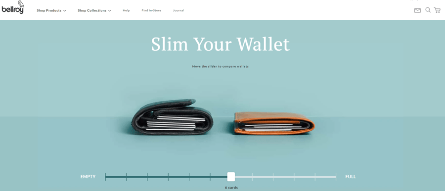
Source: https://bellroy.com/explore/slim-your-wallet
Your website should be attractive, but also easy to navigate. Make sure you don’t clutter up your landing page when trying to make it visually appealing. A beautiful page is meaningless if your customer can’t find what they want quickly.
The bottom line with visual appeal is that less is more. Limit your graphics to one or two focus points, and make sure you polish those points. Remember, a little style goes a long way.
2. Make it Urgent
According to a recent study by Episerver, only 17% of visitors to eCommerce sites make a purchase. How do you convince that 83% to buy? By making it urgent.
Even if a customer likes your product, they may not decide to buy right away. They might decide to mull it over or keep comparing it with your competitors. Hesitation could lead to an abandoned cart or a lost sale.
Limited Time Offers
Make sure you are offering an incentive to act now. By offering discounts, free shipping, or limited time offers, you add a sense of urgency. That urgency will transform a browsing session into a customer conversion.
Try adding a countdown timer to a coupon or an end date to a sale price. By adding a little tension to the situation, your viewer is more likely to try your product.
Analysis Paralysis
Some browsers want to compare competitors before they buy, no matter what. Ensure you are demonstrating value to those potential customers. Entice your customers to act now with free content upgrades. PDF's, special discounts, or downloadable content are popular options.
Remember to ask for an email or social media share in exchange. By capturing a point of contact, you make it possible to follow up. How do you use that point of contact? Read on!
3. Learn to Follow Up
So, you have great content and a flashy landing page. What do you do about the dreaded abandoned carts?
Sometimes a customer becomes confused or frustrated with your checkout. Sometimes, they forgot what they were doing. When your eCommerce site has abandoned carts, you need to follow up.
To improve your landing page conversion rate, you need a way to follow up with your visitors. For that, you need a custom pitch and a way to deliver that pitch. In other words, you need a landing page email magnet and abandoned cart software.
Email Magnet
Ensure a point of contact with your potential customers by building an email magnet. With a landing page email magnet, you can follow up with a customer, even if they walk away.
Remember, no one wants to give out their personal information for free. To entice your customer into sharing their email with you, be sure to offer them something in return.
Try offering free eBooks, PDFs, or other content upgrades. These freebies grab attention and show value to your guest. At the same time, you are capturing customers’ email, allowing you to follow up.
Abandoned Cart Software
Even with your best landing page, you will still have lots of visitors walk away. Abandoned cart software aims to fix that.
This software tracks your visitors and follows up with automatic, tailored email pitches. Using abandoned cart software will also help you prevent future losses.
4. Streamline Checkout
One of the biggest turn-away points for a potential customer is in the checkout. That is why it’s so important to have an easy, fast checkout process. Streamline your checkout by accepting multiple payment types and allowing automatic account creation.
Payment Platforms
Most customers expect your checkout to support all major credit cards and alternative payment methods, such as PayPal. You can increase your customer satisfaction by offering other options. Even if a payment method is unusual, it isn’t worth the risk of losing a sale because you don’t accept someone’s preferred tender.
Popular payment platforms include Google Wallet, Apple Pay, and Amazon Pay.
With payment platforms, more is better. That said, don’t overwhelm your shopper. Offering an entire list of payment option badges right on the main page is intimidating.
Try listing only 2-3 of the most popular options. Below that, you can offer a redirect link that brings up a full list. That way, your customers have all the options and none of the stress.
Account Creation
Customer accounts are an excellent tool for email capture and targeted sales. That said, make sure the process is fast and straightforward.
Many customers object to having to make an account. They will abandon their cart and never return if they feel forced into creating a login. By supporting automatic account creation, you give your guest a one-click option.
With one-click account creation, your customer is happy, and you get all the vital sales information you need. Social media and email platforms like Google, Facebook, and Outlook offer automatic accounts.
Even with linked accounts, some guests do not want to create a login no matter what. Make sure you are offering guest checkout for those customers. Guest checkout is also an email capture point that won’t annoy your customer.
5. Show Social Proof
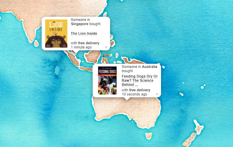
Source: https://www.bookdepository.com/live
Humans are social creatures, and never is this more obvious than while shopping. Some customers comparison shop, while others read reviews. The real moment of truth comes when they consult social media.
More than half of online shoppers say they bought something after seeing it on social media. Testimonials, reviews, and influencers are essential to eCommerce. Showing your customers that people they trust choose your products is social proof.
It isn’t exclusive to the big names, either. Encourage your existing customers to leave reviews or share on social media. For example, you may try offering discounts for using your hashtag or re-tweeting.
Social media posts help build a meaningful relationship with your audience. The genuine voice of a real customer goes a long way. Keep social proof front and center. That allows you to tell your brand story and build a relationship with your customers.
Remember, a picture is worth a thousand words. Customers respond best to content that displays the product in use. A potential customer is much more likely to follow up on a social media share than an advertisement. Everyone knows what an ad looks like and knows how to ignore it. But when your best friend tells you about a product, you listen.
6. Customer Service
Many shoppers are loyal to big box stores, even when they aren't entirely satisfied. With so many eCommerce alternatives, why do they keep going back? Because they trust the big box store customer service.
Make sure your customer knows that your online business offers terrific customer service. Show them the same guarantees they have come to expect from major retailers. That means responsive support staff and an attitude of gratitude towards repeat customers.
Let your landing page tell customers what you will do to ensure their satisfaction. Make your site enticing by checking all or most of the following customer service boxes.
- Awards won
- Free returns
- 24/7 live chat
- Combined shipping
- Coupons or special offers
- Frequently asked questions
- Visible phone number (and address, if applicable)
- Quality certifications (Better Business Bureau, ESRB)
While the customer may not always be right, they still deserve to feel right. A customer is more likely to try a new brand if they know you back your products with a warranty or return policy.
7. Mobile Optimization
A recent study by Google found something significant. Customers who have negative mobile experiences are 62% less likely to buy.
Customers in 2021 are not impressed with a site that looks bad on mobile. Even worse, Google will not rank your site highly without mobile optimization. All the SEO in the world can’t save you from a bad Google ranking!
Mobile optimization should be a top priority for any eCommerce site. The best way to do this is to check your site with Google’s Mobile-friendly test.
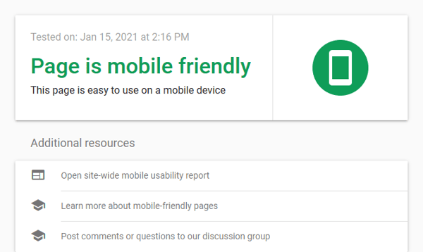
Source: https://search.google.com/test/mobile-friendly
Google’s tool will give you detailed, actionable advice to improve your site’s mobile view. Everything from font size, load speeds, HTML usage, and so much more factor into this score.
Mobile optimization could be as simple as increasing the size of your navigation buttons or removing some of your large graphics. By using Google’s free tool, you are getting your advice straight from the horses’ mouth.
8. Copyediting
Chances are that you will need a second pair of eyes to proofread or a content editor. No matter how big or small your site is. A misspelled landing page or a glaring grammatical error instantly ruins your credibility.
During the editing process, you should also make sure your site has quality on-page SEO. Keyword optimization, H2/H3, internal links, and easily navigable menus and categories are all essential. Of course, it doesn’t matter what your text says if no one has time to read it.
Make sure your landing page is concise, clear, and relevant. Avoid long, poetic, or wordy passages. Your customers will ignore them.
That isn’t to say that there is no place for long-form content. White paper content, sales copy, and blog posts consistently score best at 1,500- to 2,000 words. Make sure to keep your lengthy explanations in a designated blog section to avoid clutter.
For more advice on how to write impactful marketing content, check out this guide. Keep your pitch informative, brief, and check for mistakes! A quick edit now will save you embarrassment later on. As they say, to err is human, to edit, divine.
9. Use Personalized Landing Pages
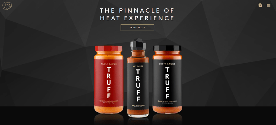
Source: https://truff.com/
A useful landing page displays the product front and center. How do you choose which products to display? That’s where personalization comes in.
One of the biggest mistakes in page layout is to cast too broad of a net. Content aimed at everyone is not impactful. To make a sale, you need to know a bit about your buyer. For that, you need personalization software.
Consider using an AI-driven smart software, which can help you tailor the browsing experience to each customer. These types of software use A/B testing, predictive algorithms, and third-party sources. The program then analyzes customer browsing patterns and demographic information.
The software uses this information to choose which products to display. Each visitor will see a custom landing page to maximize impact. Here is an example of personalized landing pages at work.
Imagine a shopper comes to your site looking for Apple-compatible devices. The personalization software will take note. The next time they visit, your landing page will dynamically update. The program will then match the customer’s preference by displaying Apple products.
This software can also analyze the recent browsing history of your potential customer. The software then generates a personalized landing page for that customer.
Imagine a customer is searching for dog toys. They search up a term like "dog toys online" and generate a SERP (search engine result page). If they click on your site from that SERP, your software will take note. Even though you sell many things, your customer is shopping for one thing. This customer wants to look at dog toys, so your dynamic landing page will display dog toys front and center.
Conclusion
In this post, we provided you with several tips on how to increase the conversion of your landing pages. But there is one thing that is obvious but so valuable that it makes sense to repeat it once more.
Testing.
The only way how you can move forward is to constantly test. There is no way around it. As we discussed in the beginning, even moving the needle from a 1% to 1.25% conversion rate will make a huge difference in the bottom line of your business.
So never accept the status quo and just keep testing again and again!


Leave a reply or comment below